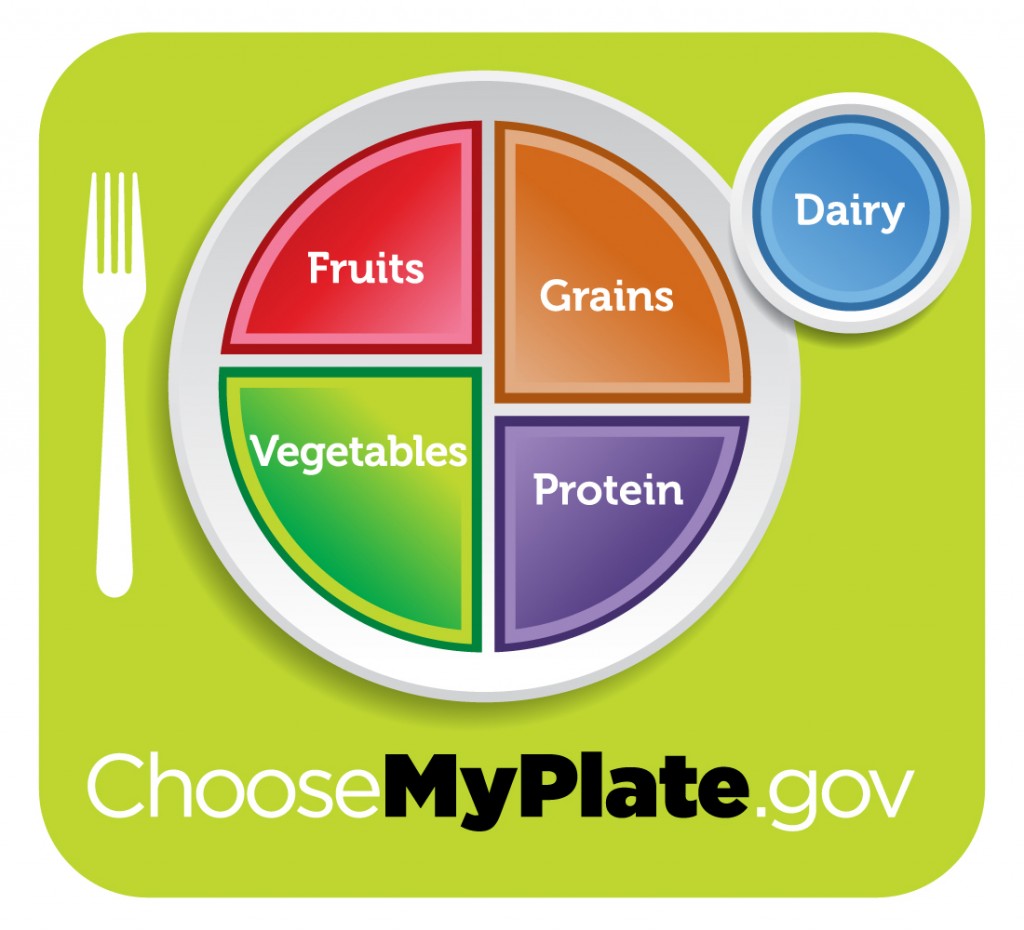
The USDA has chosen a new visual to give Americans a primer on diet and nutrition. The United States’ official stance on eating healthy is now summed up with a new, colorful plate icon.
The use of imagery to help guide food choices dates back to 1958 when a rectangle illustrated the four basic food groups: dairy, meat, fruits & vegetables, and breads & cereals. After morphing into a controversial design in 1979 where food groups were stacked upon one another, a pyramid design was introduced in 1991 and then completely “remodeled” in 2005. Ironically, during the tenure of these nutrition symbols, Americans have become fatter and fatter with childhood and adult obesity rates skyrocketing to alarming levels. After reading Marion Nestle’s Food Politics several years ago, I finally realized that while I believed these symbols reflected the best and latest nutritional thinking of their time, the reality was at best they were flawed compromises strongly influenced by the food and dairy industries as well as a long list of other special interest groups.
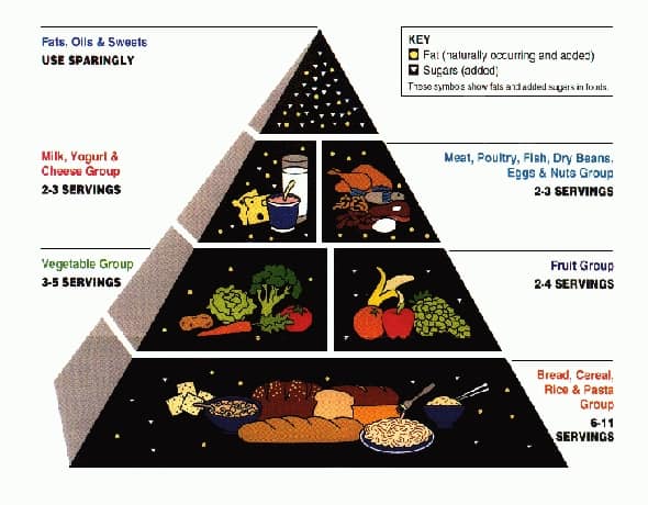
Taking a look back at the 1992 pyramid, you can see the origins of our carb-loving, obese nation in the foundation of this pyramid that was dominated by breads, cereals, rice and pasta. The one thing I did always like about the original pyramid design was its use of the top of the pyramid to declare fats, oils, and sweets should be used “sparingly”. Unfortunately this message could have been more impactful if more items like simple carbs were included or if more intuitive food descriptions were used like fast food, salty snacks, desserts, and soft drinks. Of course, directions like that might have been way too useful to the public and offensive to the food and beverage industry.

And then in 2005 came MyPyramid. I distinctly remember when this dietary visual was introduced. At the time I was working for General Mills’ cereal division as a marketing manager, and the cereal giant was slapping the pyramid on boxes right and left as part of a big PR campaign with the USDA. It surprised me how food companies were working so hand in hand with the USDA on this pyramid, but at that point in time I was unaware of what influence food companies had in food politicss. I should have realized their influence because in many ways, the 2005 MyPyramid design embodied the food industry’s single biggest strategy – confusion. Unfortunately for consumers the new pyramid communicated absolutely nothing. As Marion Nestle said on her blog last week, “The food industry liked this one [pyramid] because it did not indicate hierarchies in food choices. Most nutritionists that I know hardly knew what to do with it.” In the end, “MyPyramid was a travesty-hopelessly complicated” and “impossible to teach.” Thankfully, this food guidance image was our most short-lived visual, lasting only about six years.
So that brings us to today, and my thoughts about the new MyPlate visual. To be honest, MyPlate really isn’t too controversial or earth-shattering. In many ways this plate is very similar to the guides used by the American Institute for Cancer Research and the American Diabetes Association. I like the prominence of fruits and vegetables on the plate. If you contrast the plate to the past two pyramids, fruits and veggies definitely feel more important.
I do think an opportunity was missed with grains to communicate not all grains are created equal. However, the biggest missed opportunity is the communication of what must be limited or “used sparingly”, to quote the 1992 pyramid, in one’s diet. I’m sure before we know it, fast food manufacurers and snack purveyors will be morphing their fat-laden, simple carb, salt-saturated foods onto MyPlate convincing Americans that their food is good food. In fact, my guess is they already have their images ready to launch (sidebar – I just checked McDonald’s website and no such images are being featured … at least not yet!). Hopefully some simple, straight foward guidance on this “foods to avoid” front will be forthcoming, but I won’t hold by breath. Regardless, MyPlate moves America past the confusion of MyPyramid and communicates the basics of a healthier diet.
What do you think of MyPlate? Did the USDA get it right this time or not? Speak up and let your voice be heard.
GET MY FREE BOOK NOW!
End the confusion! Learn what’s really in your food and how to take simple steps toward eating healthier!
EAT HEALTHIER TONIGHT!
If you enjoyed this article or recipe may I ask you a favor? Please share it with a friend. Why? Because together we can make a difference and help each other live happier and healthier lives. Thank you!



5 Responses
There’s a great follow-up post about the USDA’s new MyPlate guidelines on Marion Nestle’s blog Food Politics (www.foodpolitics.com). Included are some of the main talking points used in a preview conference call discussing MyPlate. It’s great to see the direction of balancing calories, portion-size, fruits and veggies, and whole grains. While I was pleased to see “foods to reduce” as well, I think they list they called out could have been more extensive.
As Marion Nestle comments, I’m sure the USDA is taking some heat on this one. I hope they have the ability to stand firm.
Great points! I like the MyPlate more as well, but I’m waiting for the other shoe to drop. Hopefully I’m wrong. Jay
Totally agree Jay. But at least we are working from a stronger starting point here with MyPlate. The show was over before it started with MyPyramid. It was a meaningless, unteachable tool.
Bruce I think this plate is rather weak. Here is Harvard’s own plate. Its a lot better plus it includes water and healthy oils, and more vegetables. Let me know what you think about this one http://www.hsph.harvard.edu/nutritionsource/what-should-you-eat/pyramid/